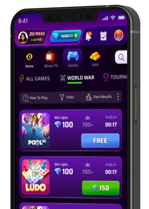
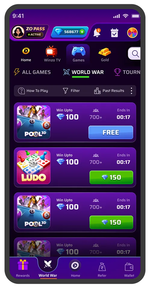
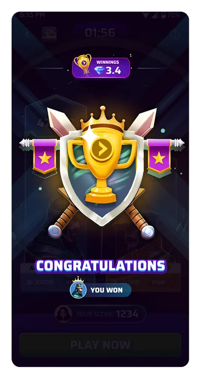
more FTU joining their first game within first 10 seconds
Increase in users contributing their first score
Less users dropped off from the listing screen within first 5 seconds
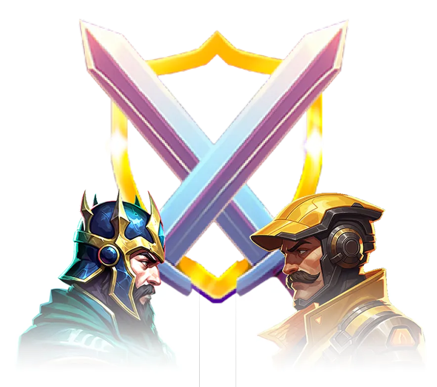
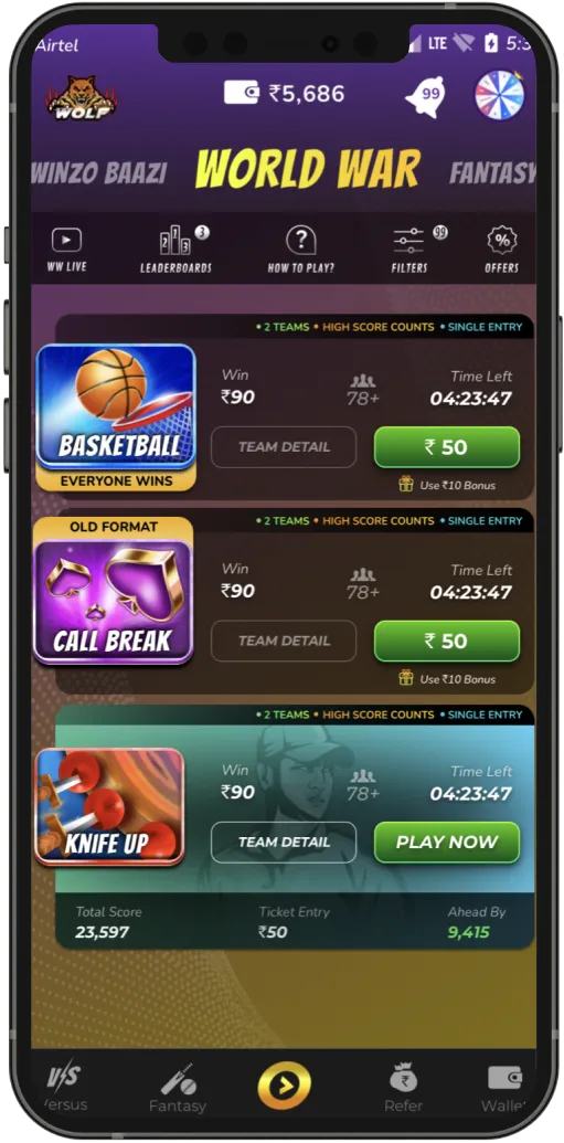
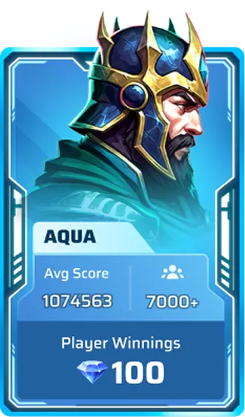
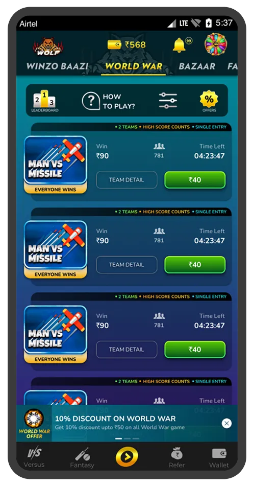
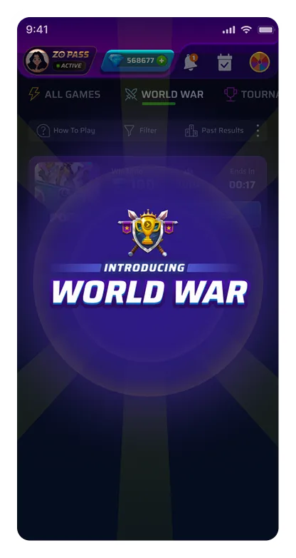
A team-based tournament format where a player joins one of 2 teams, plays a casual game and submits their scores. The team with the higher average score wins, and the prize pool is split equally.
It was the second-highest revenue-generating format. This made us hesitant to change, but when we started expanding to other geographies like Brazil and USA, we saw an opportunity to relook at the full experience
The data pointed at two major drop-off points and a steady stream of confused support tickets.
We conducted 24 semi-structured in-depth interviews. Below are the major insights from the study:
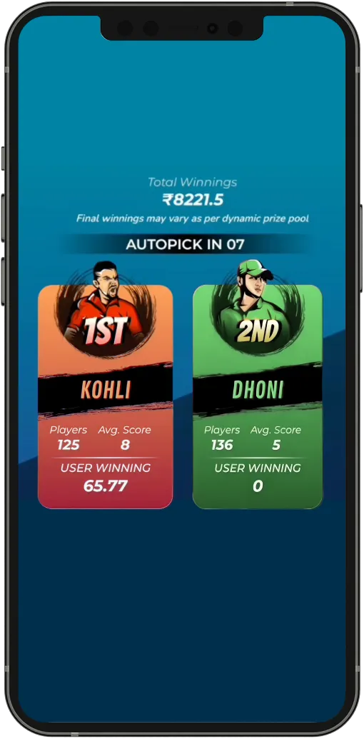
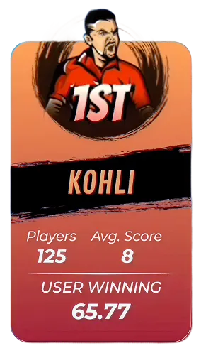
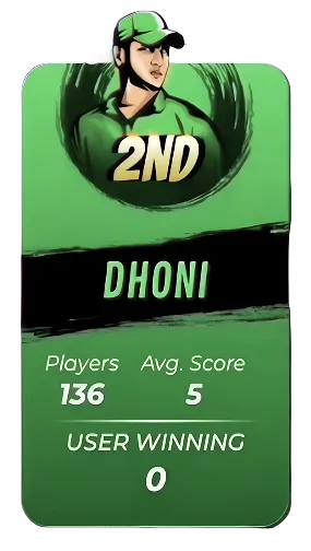
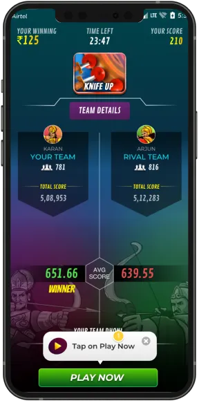
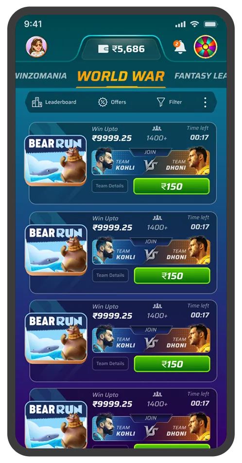
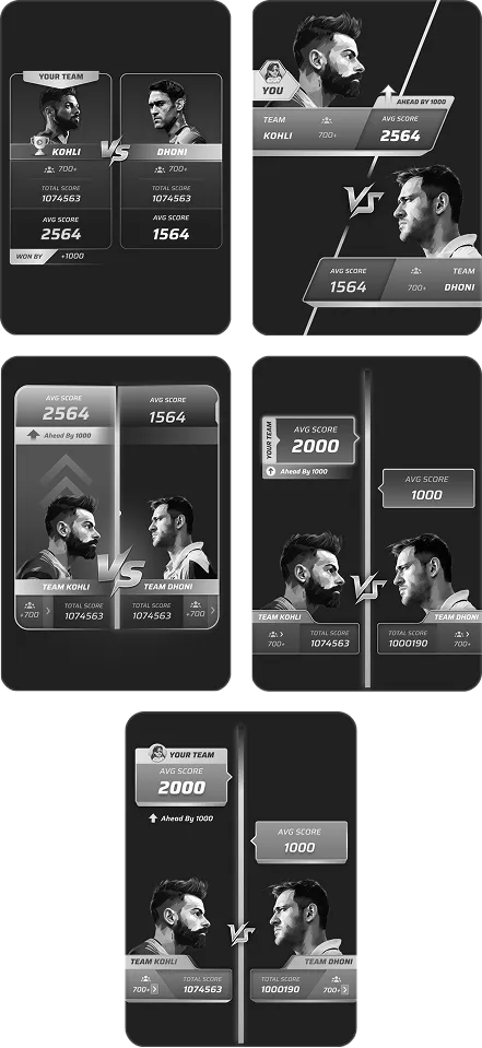
Teams were represented by illustrations of two famous Indian cricket players; Virat Kohli and MS Dhoni.
20 of 24 users expressed that they assumed the game would be cricket-related. When they hit play and a completely different game launched, the experience broke their expectations.
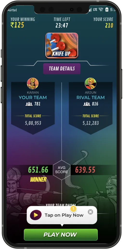
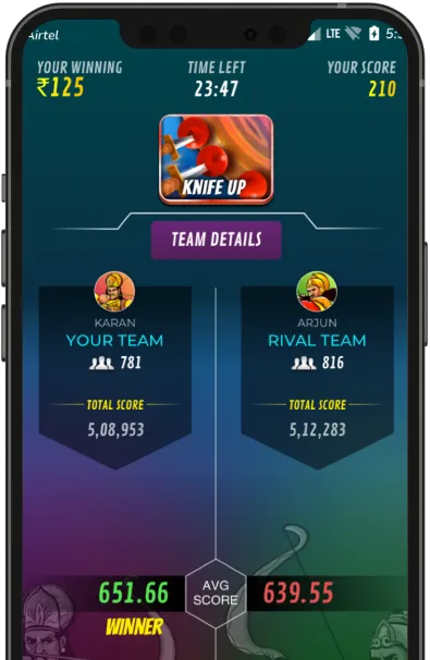
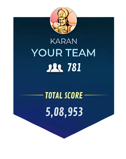
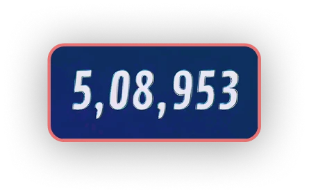
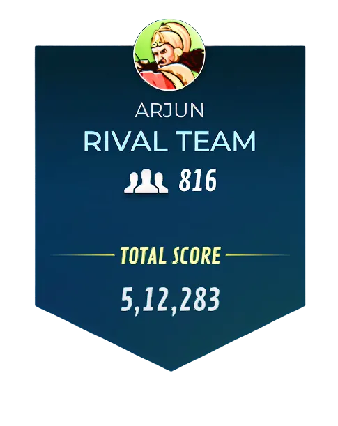
17 users said they couldn't tell if their team was ahead or behind. The scores were 6–7 digits long, making them hard to compare.
15 users described it as "stuck" or "frozen". Nothing about the screen communicated that a live competition was happening.
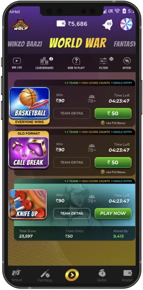
On arriving at the World War tab, there was no way to understand the format. The "How to Play" button was small and easy to miss.
We audited the whole format within the team to identify obvious design issues.
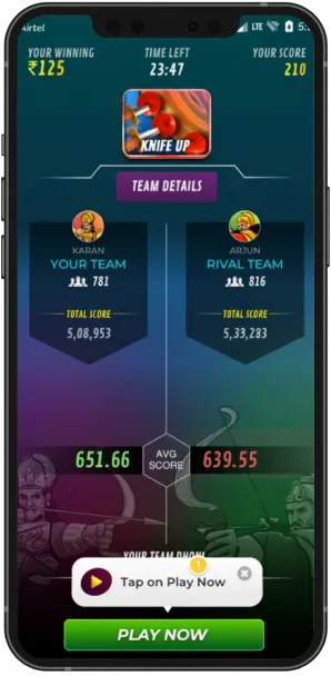
Teams were differentiated by red and green: colors that carry negative and positive association. A user in the red team would see a red tinted tournament card even if their team was leading. This was a critical miscommunication.
Green card but 0 winnings? Red card but higher winnings? The color and winnings mismatch happened often and was confusing.
Comparing 6–7 digit scores at a glance takes real cognitive effort. By the time a user understood who was ahead, the moment to act had passed.
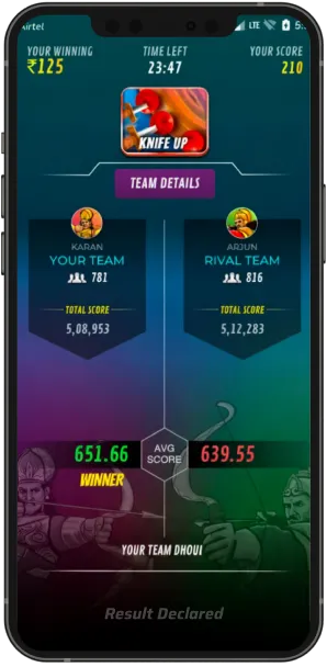
When a tournament ended, the only change on the scoreboard was a small "winner tag" on the relevant team side. Winning and losing were visually indistinguishable.
During Tournament
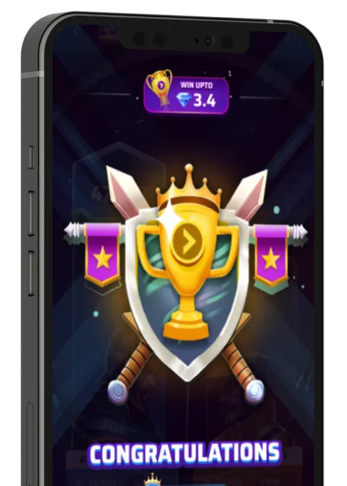
After Result's Declared
Every decision that followed was informed by one of these.
In competitive formats, players act on perceived advantage. If users can't immediately read who's winning, they can't make a rational decision to participate.
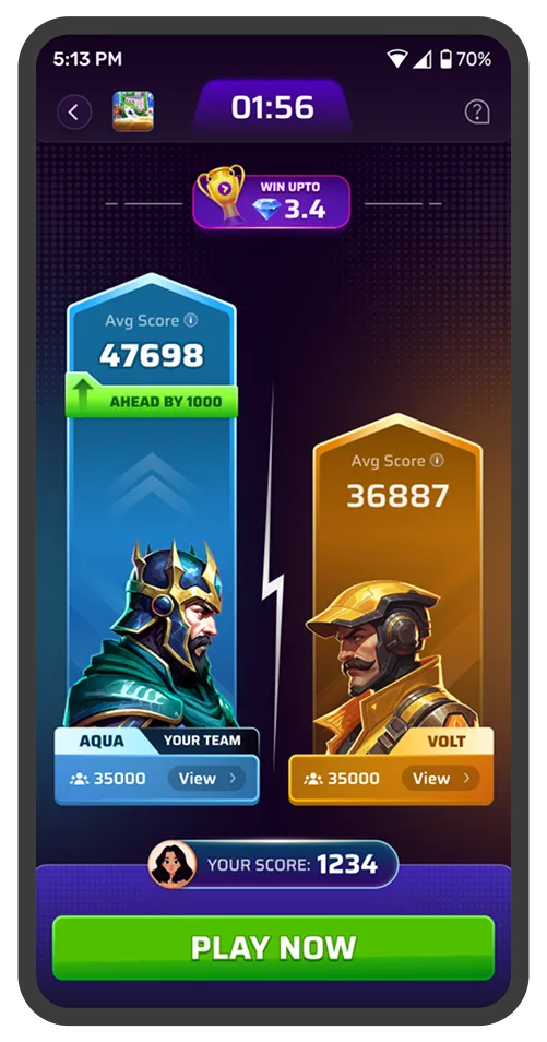
Less thinking, more acting. The listing, team selection, and scoreboard were redesigned so the questions like "Are we winning?" "Should I play?" were answered without effort.
Static tutorials and "How to Play" buttons have near-zero retention. The most effective way to teach a format is to move users through it with the right nudge at the right moment.
Every action needs a visible consequence. When actions have no reaction, users disengage. When they see their score affect the outcome, they are more likely to come back.
Once we understood the problem, we brainstormed freely. 20+ ideas across four areas: identity, live feel, onboarding, and score readability. Not all of them were good, but they helped us explore options before deciding what to actually build.
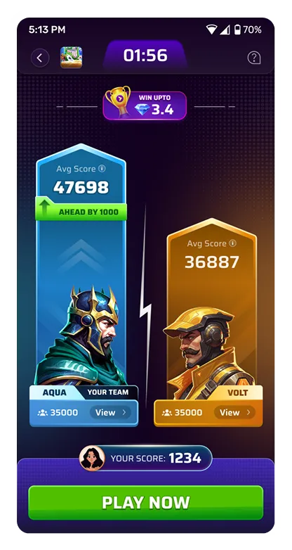
The scoreboard is where users spend the majority of tournament time. It's where the race should be felt, and where the format either clicks or doesn't.
Before
Iterations
Final Design
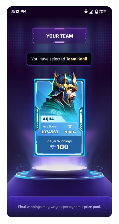
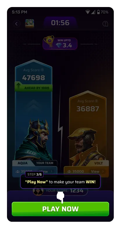
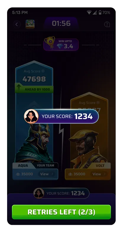
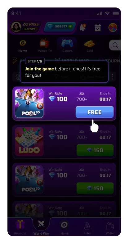
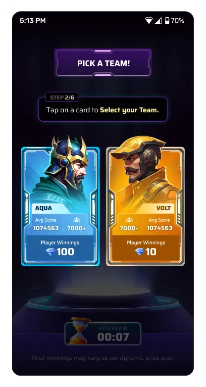
The 61% drop-off wasn’t a design problem — it was a comprehension problem. Games like Candy Crush and Royal Match have solved this consistently: don’t explain, just move users through it. So we designed a four-step interactive tutorial built into the first tournament for a new user encounters.
The tutorial tournament is free. No entry fee, no risk. A micro-animation pulses on the “Free” entry button. Timer creates mild urgency.
The team selection cards are designed so the two mascots face each other. Competitiveness is communicated visually before a word is read.
A pulsing highlight draws attention to the “Play Now” button with a single line of copy: “Play now to help your team win”. The connection between user’s contribution in team outcome is made explicit through the nudge.
After the user submits their first score, the number appears at the centre of the screen and merges into their team’s bar. The bar grows. The user sees, in real time, that they made an impact. The format is now understood because it was experienced.
Measured over a 60-day evaluation period following full rollout.
Learnings we took away from the project and things we could have done better.
We only learned about constraints on the tower size change after handoff, so we had to rework assets to fit the new implementation without losing design intent. It cost us time we could have saved by bringing tech into the conversation earlier. Now we treat early engineering input as part of the design process, not a step that comes after it.
We leaned into gradient-heavy, dynamic animations to make winning feel rewarding, but they didn't hold up in production on lower-end devices. We ended up shipping no-gradient versions that kept the same emotional payoff while performing reliably for everyone. Performance is part of the experience, not a trade-off against it.
Users told us they skipped games because they didn't understand the format, so we added detail to the listing, and the new version actually performed worse. It was a reminder that user feedback points to a problem, not always the solution. Now we take their input seriously but dig into the root cause before designing around it.
The tutorial was useful but too long for a user base with a short attention span and a desire to jump straight into their first real game. The goal is a shorter flow with punchier copy at each step, so users grasp the value of the format fast without wading through text. Brevity here isn't about cutting content; it's about respecting how people actually use the app.